What I've been up to
I've been reading. I've been hip deep in books, rolling around in words, filling up with stories. Which is good and necessary -- I'm sure you've heard it said that to writer, you have to read -- but there are so many other things I should be doing too.
Corporate taxes.
Holiday baking.
Sorting through books and putting them where they belong.
Writing letters.
Walking the puppy boys.
Cleaning up in the garden.
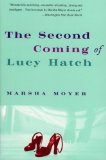 You'd think that some of those things might appeal to me at least a little, but here I sit, glued to the comfy chair with The Second Coming of Lucy Hatch. Which is turnning out to be one of those rare first person narratives that doesn't irritate me. That (so far) I'm liking a lot. The storyline isn't all that unusual, but the narrative voice is compelling, in spite of the fact that there are red high-heeled shooes on the cover.
I think there needs to be a bann on high heeled shoes on cover art.
I'm sure there are other objects that should also be banned from bookcovers because they've been overused... but I can't think of any right now. Can you?
Say I've got an idea. Leave a comment telling me what you don't like to see on a bookcover. Or just leave a comment. Tomorrow I'll pick a couple people at random and send y'all some of these books I've got in piles all over the house. My ones, you understand. I've got millions of 'em, and the more I give away, the less sorting and putting away I have to do.
Anybody can throw their name in the hat.
I'm procrastinating, too. I love Judith Ivory's novels, but some of the covers are awful. So I picked up one off my shelves to find THE BLONDE BIMBO that appears on too many romance novels: long, flowing tresses; long red dress undone and falling off her body (although a couple of things are holding it up); impassioned embrace with an overly muscled, shirtless male with skin-tight knit pants and black calf-length boots. Both of them have been body-waxed. He could use a few more IQ points. She's probably supposed to be opening her mouth for a kiss, but it looks like she needs her asthma inhaler.
I really hate when a book gets adapted to a film, and once the movie comes out, it seems the only edition you can get in stores is the one with the movie cover. It is especially irritating when the main character is lovely, but the actress playing her is one I dislike. The perfect example is "Pride and Prejudice". I went to buy the book a year ago I think, and all I could find was the edition with Kiera Knightley on the cover. I can't stand her! The worst thing is, the put what looks like a big sticker that reads "Now a major motion picture", but you can't peel it off. It's like incorporated in the picture. Do I make any sense? :)
I'm bored of the white billowy blouse on a man who has long dark hair with the woman swooning and anyone wearing a mask, oh yea and with the stallion rearing up in the background.
I don't care for the old romance "clinch covers."
I love to be surrounded by books and the more the better. Just a comforting feeling from when I was very young. Book covers with big fat red lips really bother me since they are many times totally unsuited to the specific book.
I don't like books with no cover art. You know the ones with just the authors name and the book title and the authors name in bigger text than the book title. I look at that and think the author is full of him/herself and thinks they can sell a book on their name alone which I guess some of them can but it doesn't make it appealing to me.
I really do not care for a huge eye with a complete scene within the eye. It is poor taste and many times unrelated to the book.
A cover that is too busy with too many colors, designs and writing which is terribly distracting and visually hard on the eyes.
The Second Coming of Lucy Hatch is one of my favorite books. Don't miss the sequel - it is just a good. Lucy is a great character. Also, I am currently reading Flowers From the Storm, which I won in a pile o' books a few months ago (thank you Rosina!). I have to say I am LOVING this book, can't put it down. And the cover art is great - a tree and a mansion, not a bosomy female or chesty male in sight! The covers I really hate are the ones where a character looks kind of like a "cute" cartoon drawing, seems to be a popular style right now. It works the opposite for me, though - makes me NOT want to read the book.
This weekend I started a wonderful novel. The tailor's daugher. totally enthralling and interesting. Artwork for the cover is dramatic, and well done.
I don't like the "Fabio" type covers, I think I've probably missed out on a few good stories because of that.
A silhouette of a spaghetti-strap, short, fluttery dress-- not actually on a person, but just hanging there or graphically created. Like the Red Dress Ink logo.
I dislike covers which have women drawn/photographed on them with large breasts which barely fit into their bodices. In most cases they have free flowing hair and are standing in some very peculiar positions. Many of the early copies of Judith McNaught's books have these covers, which is a shame because she is a very good author in my opinion. I was reading one of my favourite books of hers when a friend commented that she'd be too embarrassed to read a book with a cover like that in public!
My dislikes have mostly already been covered here, specifically when they put the motion picture crap all over the book. I hate that! But I think handbags, make-up and jewelry (and shoes!) should all be banned in cover art, particularly if the cover is pink. It makes it so embarrasing to be seen reading one of those books, even though there are many really good novels out there with said objects plastered all over them.
I agree with just about everyone so far. The overly sexual covers on terrific books are such a disappointment. I am so glad the ipod was invented! I can take my books with me everywhere I go.
I really dislike cover art that has nothing to do with the story. Why would I want to buy a romantic suspense novel with a cartoon on the cover?
Many others have already said it, but the swooning damsel, bosom-heaving covers including the impossibly muscled "stallion", on books that offer so much more, also must top my list of most-disliked covers.
First things first: my favorite covers usually feature art rather than people. (Susan Elizabeth Phillips' covers, for example.) I like to imagine the characters myself rather than having to overcome bad cover images.
But when I can't have that then I very much dislike covers that depict a person who in some significant way does not match the character in the story. For example, I recently read a blog entry in which Eloisa James talks about her new book. One of the pivotal points of the story concerns the fact that the heroine is considered overweight and therefore unfashionable and unwanted in the marriage market. But yet the cover of the book features a man and a very skinny woman in an embrace. Getting something that basic wrong makes it seem to me as if the publishing house just doesn't care. And maybe I am taking it too personally but it insults my intelligence.
I don't like to see those books with a lot of text on the cover, particularly when it's a mish mash of sizes and font styles. It screams "self-published treatise on how to teach your dog to cook a french
omelette (AND YOU WON'T GAIN A POUND!)" although sometimes there's a gem hidden behind the proclamations. In my experience it's mainly self-help or nutrition or diet books hidden by these covers. I've got several books of this cover style and I think they were all given to me as gifts or "you've gotta read this" books. Which is fine - those covers turn me right off and I leave it to my friends and relatives to judge the book behind that style of cover.
I don't like covers art at all, that is why I prefer a hard back book. The first thing I do is take the cover off my hardback books. I do like beautiful script on the title and author. I do have to add that the exception for me was the cover to QOS, I thought that was done well.
I am much more of a "back of the book" kind of girl. Though in my teens, I loved book covers that gave a sense of time period and setting. I agree that clinch-covers are not to be desired~
A drawing cover that makes the book look humorous when in reality it's not.
My greatist dislike in book covers has already been mentioned several times. A man and woman in the throse of a passionate encounter. The other is a close up photo of a face. That picture I am sure is not picked out by the author and may not be what they invisioned. I would rather get the picture that the author writes.
I would have to agree with Joyce, why put something on the cover that does not really pertain to the story???
Ugh. I'm in the crowd of readers who feel too embarrassed to read a book in public with a trashy cover. Romantic embraces, women falling out of their dresses, man-titty... Yuck.
Half-clad women with their faces "depersonalized" by being cut off somewhere below the eyes. Both my books featured such covers -- as a first-time author with a big publishing house I was pressured into accepting this.
I also (like some readers above) don't like pictures of empty women's clothing and shoes. Actually, I don't like occupied shoes, either. Truncated female body parts.
The covers with the pictures of multiple faces (presumably of the characters in the book) looking out at the reader, breaking the 4th wall - these are the covers that annoy me.
Many years ago, I bought a copy of Wuthering Heights - the cover features the painting "Lady Hamilton as Circe" by George Romney. The two have been linked in my head for years, but lately, I'm seeing this particular painting all over book cover art. Enough already.
I also want to add that I'm a sucker for the paper stock a book cover is printed on - I'll buy anything if it has a nice velvety feel under my fingers - not glossy, but almost a suede feel. Okay, maybe not *anything*, but I'll certainly linger over those books.
A few others have mentioned it already... I dislike the book covers of books that show the actors from the movie that was made from the book. Insult to injury is that I usually can not find a copy without that particular cover.
I dislike the depiction on the cover of a detective novel of a clue which contains the kernel of the solution. This seems to insult the reader's intelligence, and take away from their experience of ferreting out the mystery themselves. It also seems counterproductive and discourteous to the author.
You might like the hardcover art for Lucy better. Or not. It came out when everyone was depicting disembodied legs.
inner... critic... sleeping...
I love books! I am just finishing up the semester, one more paper to go, and soon I will be able to read a novel. Lots of novels. I plan on reading for three weeks straight!
I love the bodice-ripper/clinch covers, a little bit of naughtiness makes my day.
Oh, just thought of a style of cover I didn't like, a few years ago some Stephen King paperbacks were reissued with black covers and strange symbols on them, looked like weird clip-art. I didn't like those designs, they were weird.
Took me a while, I'm too easy going lately I think(My mental armor dosn't come off till after the holidays for sanity's sake :D )Those quaint, pictuesque covers on the Mystery novels are kinda dull. Cover art that hints that shi* happens in even the most tranquil of places. zzzz
Vampires! I'm sick to death (no pun intended) of seeing vampires on book covers. For the love of PETE (whoever Pete was) do women REALLY want to be under the covers with an actual vampire? Can you even imagine what THEIR BREATH must be like???
Susan Diegel, Knoxville, TN.
P.S. If I were to ever win anything, I would love for it to be one of YOUR books... (my faves, and I've read all of them) but it would be really "special" to have one from your stack.
Susan Diegel,
2124 Berrywood Dr.
Knoxville, TN 37932